


Serpact Branding Guidelines
Branding
Please read our branding guidelines how to use the Serpact logo.
Logo
Serpact’s logo consists of a graphic symbol – a stylized letter S and a typeface of the brand.


Horizontal logo – This is our standard logo for communication.
Vertical logo – used only in private cases where there are sizes and space restrictions for a logo.
Colour
White logo
The logo may only be used in negative if there is sufficient contrast between the white logo and the background.


Horizontal logo
Vertical logo
Graphic symbol
The graphic symbol can be used independently in positive and negative versions. The use of a negative version without sufficient contrast between the background and the graphic symbol is not allowed.


Safe Zone
It is mandatory to observe the so-called Safe Zone, which ensures that the logo does not interfere with the surrounding objects in the composition.

Logo

Graphic symbol

Logo

Graphic symbol
Misuse
Certain manipulations of the logo that lead to its incorrect use from a technical and aesthetic point of view are not allowed.

Do not apply outlines

Do not apply solid drop shadows
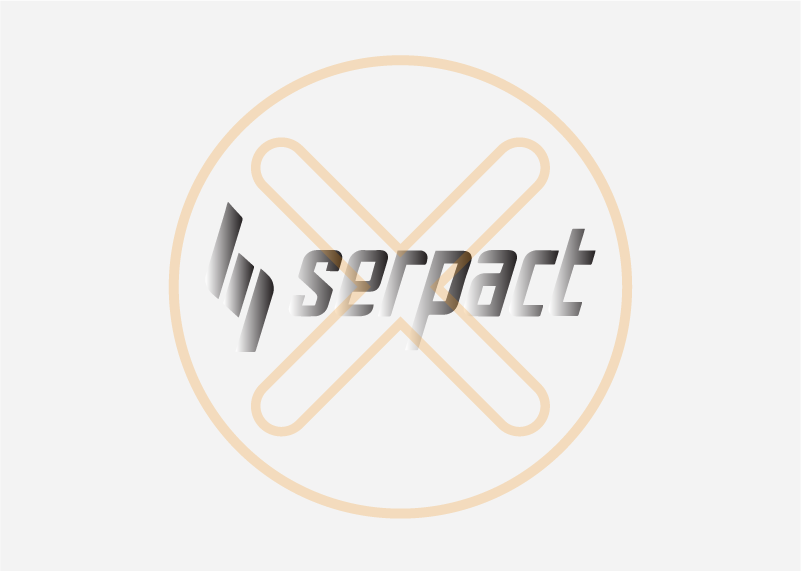
Do not apply gradients

Do not skew or stretch

Do not change orientation
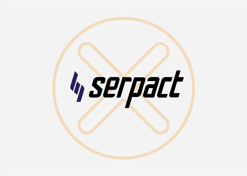
Do not adapt the logo

Do not mix colours

Do not fill with patterns

do not – Apply outlines

do not apply solid dropshadows

do not – Apply gradients

do not – Skew, stretch

do not – Change Orientation

do not – Adapt the logo

do not – Mix colours

do not – Fill with patterns
Brand colours
Primary
Purple
HEX #261Е5А
Secondary
Green
HEX #A1DB0A
Yellow
HEX #FFE016
Orange
HEX #BFF9803
Black
HEX #000000
Grey
HEX #F3F3F3