What is Mobile First Index?
 8
8 
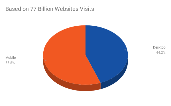
Mobile First Index / or MFI means a complete change in the way Google evaluates and ranks websites on search. The global search engine algorithm is already analyzing the readiness of mobile-priority indexing sites, based on technical and content requirements, as well as their usability on a mobile device and, on that basis, ranking them in SERP. This has been necessitated by the increased use of smartphones worldwide in recent years.
Just to offer good results to users who use mostly smartphones, Google already evaluates your site first as a mobile site. To do this, go to Google with your smartphone agent page.
The purpose of this article is to prepare you for this change and give you best practices to succeed in the new environment. Before you continue, write down this tool that is always at your fingertips. It tests your site on how it behaves on a mobile phone and provides recommendations for bugs – https://search.google.com/test/mobile-friendly. Test the speed of your mobile site with this tool – https://testmysite.withgoogle.com/intl/en-gb.
If your site uses 2 versions – desktop and mobile version
You will wonder why we need to talk about 2 versions, as the world is already powerfully switching to responsive design. The big surprise, however, is that there are many sites that continue to support 2 versions – desktop and mobile. This is for 2 reasons – either an old site that has slightly adapted over time to build a mobile version, or a site that is too large or bulky and retains both versions for the desktop version to be rich – with ads, widgets and the like, and the mobile version is lightweight. There are Facebook, a lot of news sites, such as Dir.bg, Dnevnik, Focus News.
In that case, you are looking after the de facto two sites and although prepared for different screens, they should have some things in common.
A. Your website must contain the same content in both versions
Content is most important, it gives information to the user and it is Google who analyzes it to evaluate your site. So the main content – the posts, news, articles themselves – must be the same in both versions of your site.
B. Structured data must be present on both versions
The structural data that you have used in your primary / desktop / site should also be present in the mobile version. This is structured data for Local Business, Article, Recipe, Rating, Product + Offer and more.
C. The metadata must be the same on both versions of your site
Meta data – such as Title and Description, but many more – must be the same on both versions of your site so that there is no mismatch, and Google doesn’t think you are trying to abuse it. If you are worried that you will have a duplicate on your site, there is a smart way to show the search engine that it is a mobile phone version – everything will be correct and you will have no reason to worry:
<link rel="alternate" media="handheld" href="https://site.com/m/someurl" />
This is placed at https://site.com/someurl to indicate that it also has a mobile version – https://site.com/m/someurl.
D. Verify both versions of your site in Google Search Console
Confirm both versions of your site in Google Search Console so Google can crawl and index both and rank them according to their quality.
E. Add a mobile version Sitemap
A sitemap is also needed for the mobile variant of your site, it makes it easy for Google to crawl your addresses in the mobile version and rank them in search.
E. Check your robots.txt
Check that the robots.txt file is correct, not block Google Mobile Bot. You can easily check this in the GSC Robots.txt Testing Tool section.
2. If your site has the same version for both mobile and desktop – responsive design
These types of sites apply to all of the above, they are part of your overall onpage SEO strategy – meta data, sitemap, robots.txt, structured data, content, etc. But given the high usage of mobile phones, there are quite a few new and specific points that your mobile site needs to address.
These tips will help you stay longer on your site and use it more often, which directly affects your Google rankings – the search engine measures these metrics and gives you feedback that your site is good and with good UX (User Experience).
There is a big difference when we prepare a site for a desktop and when it will be used through a smartphone.
Here are some important global points to keep in mind:
- The site is viewed through a personal device – the user is almost permanently logged in to his social account – use FB Login or Google Login – this facilitates the use of the sites, increases the orders because almost no registration information is required
- The site is used with one or two hands, and the writing is with only two fingers
- The site is used in all weathers, in conditions of noise, low or too high light
- The site may charge slower than usual if the user is using a mobile network or Wi-Fi / worst case is charging not to get in places with no mobile coverage /
- The screen is much smaller
- Staying in a mobile site is shorter, the user reads and browses faster
In this regard, we provide the basic guidelines for a successful mobile site
Text
The text should be at least 16 pixels or larger in size. This makes it easier to read on the small screen of the phone and the user is not overloaded with your site. Many sites even experiment with text sizes of 20 or 22 pixels, and this is well accepted. It is also good to think of a space between the letters and between the lines.
word-spacing: 5px;
line-height: 22px;
Many studies indicate that with a large amount of “air” between words and lines, text is easier to read and perceive by the brain.
Headlines
Headlines are very important with mobile phones. However, there are two features to keep in mind. The titles should be large, well-regarded as a percentage of the screen size, so you will be sure that they are always visible.
h1 {font-size: 150%; font-weight: bold;}

h2 {font-size: 130%; font-weight: bold;}
Another important point is to try not to make them too long. This is because of the limited space on the phone screen. The acceptable title length is one that fills the screen from 1/3 to 1/2, and try to avoid the latter.

In this case, the above heading is longer than good practice. But of course, the most important thing is to keep the point.
Speed
Speed is of the utmost importance when browsing through a mobile phone, so try to get the best possible speed on your site. You can visit our special article on good speed for SEO. Below are some of the recommendations that Google has derived from a great deal of research and consumer analytics on higher mobile site success. Keep in mind that Google also pays attention to the speed of your site when considering moving to mobile-first indexing.
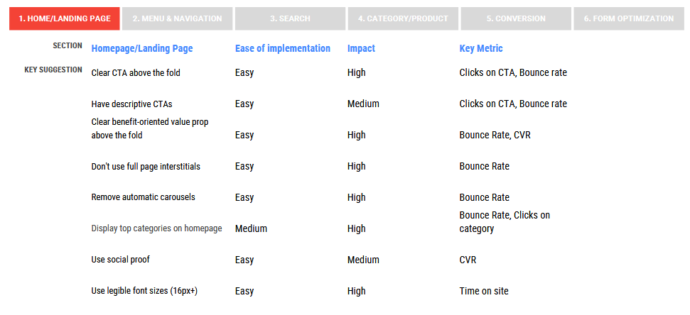
Homepage
Google recommendations for the homepage of your mobile site:
- Clear Call-To-Action (CTA) in the visible part of the screen
- Do not use pop-up ads or full-screen windows
- Show your top categories or services on the homepage
- Show social proof / recommendations and feedback from your customers that the product or service is good /
- Use a font size of 16 pixels or more
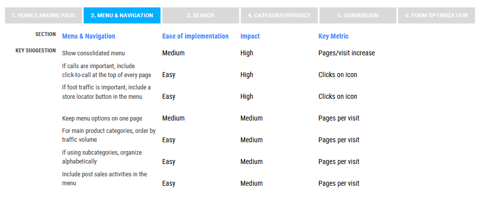
Menu and navigation
Menu and navigation recommendations:
- If the calls are important to you, use Click-To-Call at the top of each page
- If physical visits to your store are important – put a store locator button in the menu
- Organize the menu categories by most popular
- If you use subcategories, sort them alphabetically
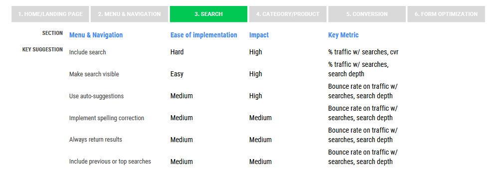
Search
Mobile / Responsive / Site Search Recommendations:
- Integrate search engine
- Make the search visible
- Use search tips
- Use search correction
- Always return a result
- Show past or top searches
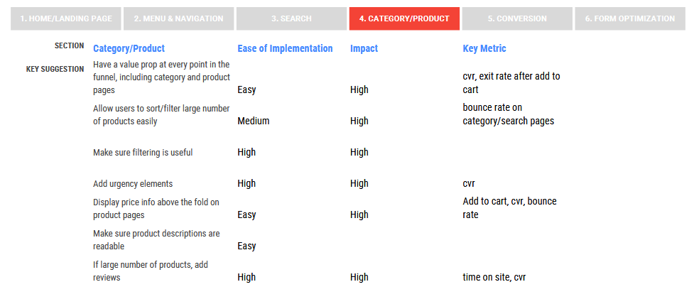
Categories and products
Recommendations for categories and products:
- Make filtering a large number of products or categories easy
- Test and make sure filtering is helpful
- Add emergency items / only this week for a price of…, etc /
- Display the price at the top of the screen
- Make sure product descriptions are easy to read
- If you have a large number of products, add reviews to them
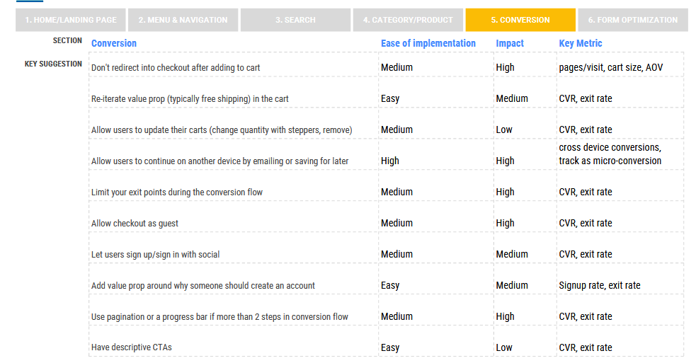
Conversions
Useful guidelines for better conversions with mobile website design:
- Do not send user for payment after ordering a product
- Show free shipping in your cart
- Let the quantity of products in the basket be changed
- Allow order completion from another device / by saving for later /
- Allow guest ordering / no registration /
- Allow registration or logging in via social account / FB, Google, Twitter,… /
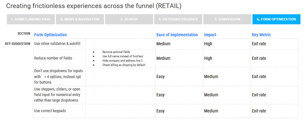
Forms
Recommendations for effective use of forms on a mobile site:
- Reduce the number of fields
- Use auto-complete and validate at the time of writing
- Use blank fields to enter numeric data / number of products, street number, etc. / instead of long drop-down fields


